Full Digi Planner PDF Template - Page Hyperlinks

At this point in the Design a Digital Planner in Affinity Suite tutorial series, we have created the page anchors and attached each anchor to a hyperlinked tab. Now we will add more hyperlinks on to the Index and Year-at-a-Glance pages. You will learn the following.
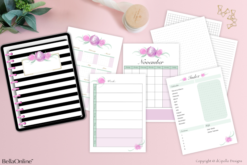
For example, the Index page design that we put in to the Picture Frame (see screenshot) has a list of the calendar months at the top left of the page and the text for the monthly names is already part of the page design. But you might want to place this calendar list at a different location on your own Index page design. In that case, we need these links to be moveable on the Canvas.
To make the hyperlinks as flexible as possible, we will draw a rectangle on the page for each hyperlink and place the rectangle over the top of the text on the page. As each link will be on its own layer, you can easily move any or all links to a different position, guided by your page design. Of course, we will make each rectangle invisible to allow the text on the page to show through.
On the Index page, we will need 21 page links (see list). However, you might need more or less links for your page design. As each link will be on its own layer, you can easily delete the links you don't need or duplicate a link group in the Layers panel for an additional link.
Note: If you do delete any page or tab links, you will also need to delete the corresponding link from the Hyperlinks panel.
Let's start by adding the Calendar links and work our way down the page.
Design a Digital Planner in Affinity Suite - Tutorial Series Index
More Affinity Suite Tutorials
Screenshots used by permission of Serif (Europe) Ltd. This article is not endorsed by Serif Ltd.
- Create a moveable and invisible hyperlink
Movable and Invisible Hyperlinks
It was fairly easy to add the hyperlinks to the tabs in our planner, because the only change you might make to the tabs is to change the color, resize or delete the tab. Basically, the tabs will not move from their position at the top or right sides. But as you will be using a new design for the Index and Year-at-a-Glance pages for each new planner, we need the hyperlinks on these pages to be movable on the Canvas.For example, the Index page design that we put in to the Picture Frame (see screenshot) has a list of the calendar months at the top left of the page and the text for the monthly names is already part of the page design. But you might want to place this calendar list at a different location on your own Index page design. In that case, we need these links to be moveable on the Canvas.
To make the hyperlinks as flexible as possible, we will draw a rectangle on the page for each hyperlink and place the rectangle over the top of the text on the page. As each link will be on its own layer, you can easily move any or all links to a different position, guided by your page design. Of course, we will make each rectangle invisible to allow the text on the page to show through.
On the Index page, we will need 21 page links (see list). However, you might need more or less links for your page design. As each link will be on its own layer, you can easily delete the links you don't need or duplicate a link group in the Layers panel for an additional link.
Note: If you do delete any page or tab links, you will also need to delete the corresponding link from the Hyperlinks panel.
Let's start by adding the Calendar links and work our way down the page.
Let's Get Started
- Open your Full Digi Planner PDF .afpub working file. Go to the Pages panel.
- Double-click the thumbnail for Page 2 (Index page), to load the page in to the Canvas.
- In the Layers panel, select the Index group layer, which contains the Inside Page master page content.
- Select the Rectangle tool. In the Context Toolbar, set the Stroke to any color, set the Stroke Width to 1 pt and the Fill color to Null (see screenshot). Draw a rectangle on the Canvas (see screenshot).
- Name this new layer to Yearly - Index Page.
- In the Transform panel, select the top left corner of the Anchor Point Selector. Set the Width to 540 px and the Height to 80 px. Depending on your design, you might need a smaller or larger rectangle (see screenshot).
- With the Yearly - Index Page layer selected in the Layers panel, right-click and choose Group. Name this new group layer Page Links (see screenshot).
- Select the Yearly - Index Page layer. To position the rectangle over the text for the first link, set the following values in the Transform panel. (see screenshot).
Draw the Rectangles
A new layer should appear above the Index group layer in the Layers panel.
To keep the Layers panel organized, let's create a group for all of the links on the Index page.
X: 230 px
Y: 525 px
Width: 540 px
Height: 80 px
Note: You can use the Transform panel to position the rectangles over the text or just use the Move tool to drag the rectangle over the text. Just remember not to overlap any rectangles.
Design a Digital Planner in Affinity Suite - Tutorial Series Index
More Affinity Suite Tutorials
Screenshots used by permission of Serif (Europe) Ltd. This article is not endorsed by Serif Ltd.
Powered by Creative Market

Related Articles
Editor's Picks Articles
Top Ten Articles
Previous Features
Site Map
Content copyright © 2023 by Diane Cipollo. All rights reserved.
This content was written by Diane Cipollo. If you wish to use this content in any manner, you need written permission. Contact Diane Cipollo for details.


